

Client
Services
Brand Development & Design
Year
Visit
Sana
A B2B software brand that finally looks as good as it works. Oh, and a bonus card game? yes, please.
This Brief
Sana came to us with a big project, building and implementing a rebrand for their entire company from inside to out. Their new identity was sharp: ownable, clean, and reflective of their expertise.
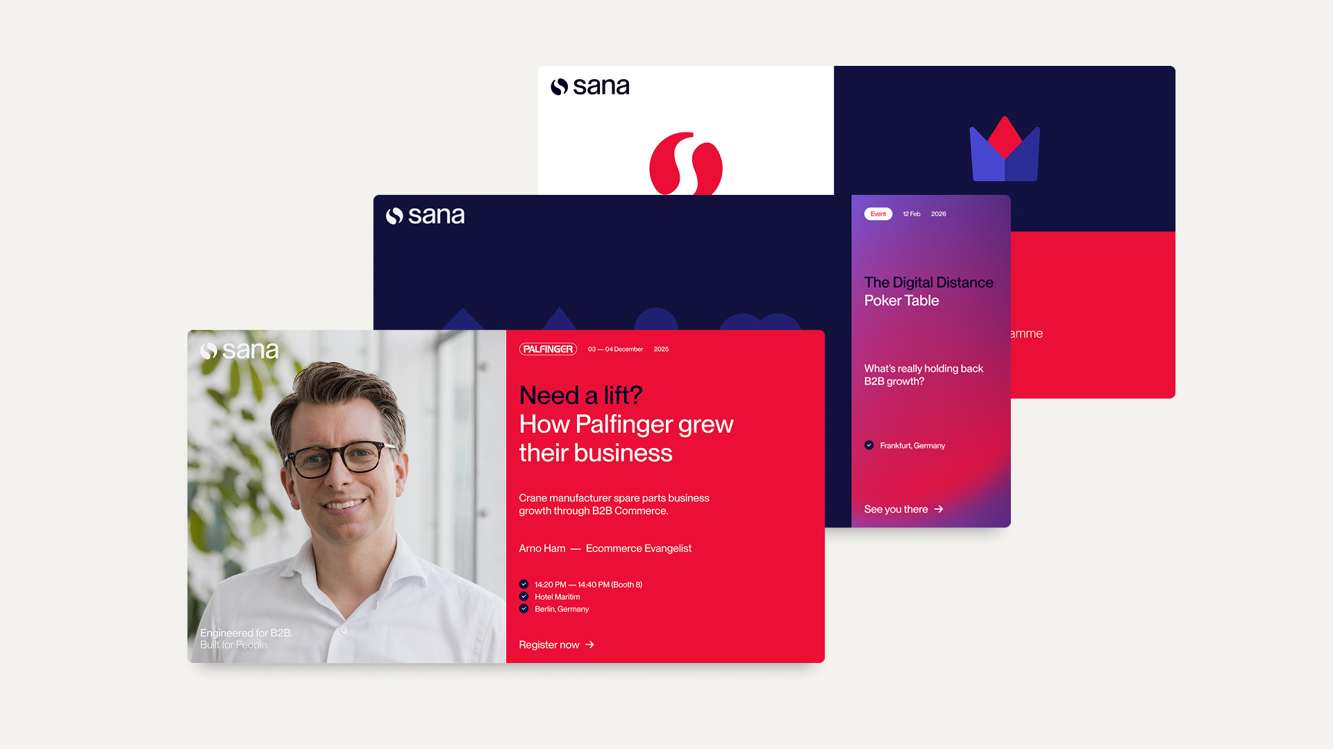
The challenge? Making it consistent, long-lasting, and part of the soul of the company: everything from social media to brochures, across a global marketing team that needed to use it all independently.
This Approach
Sana needed their fresh brand identity shown across a LOT of different touchpoints. That means a lot of deliverables, and we delivered.
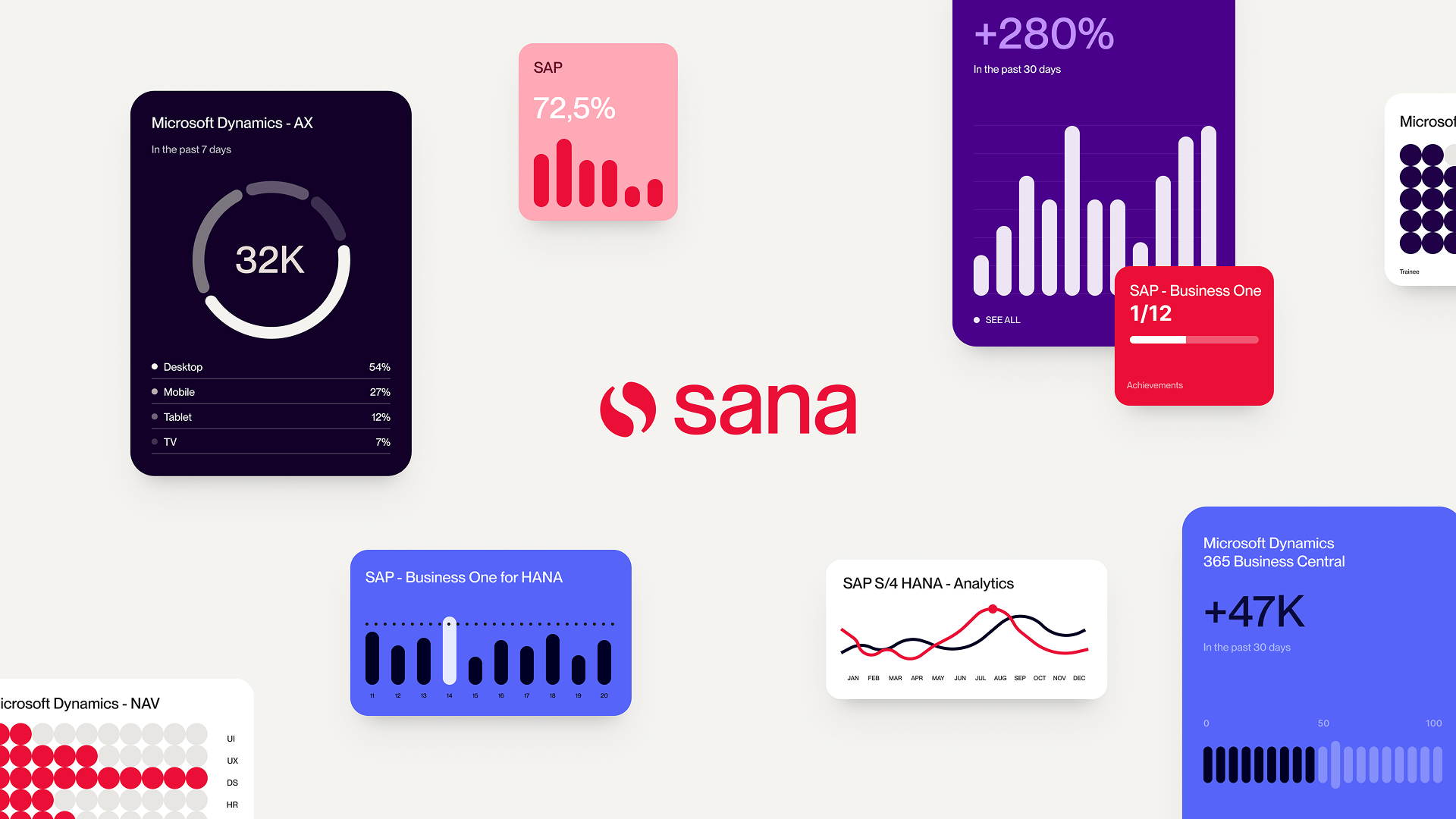
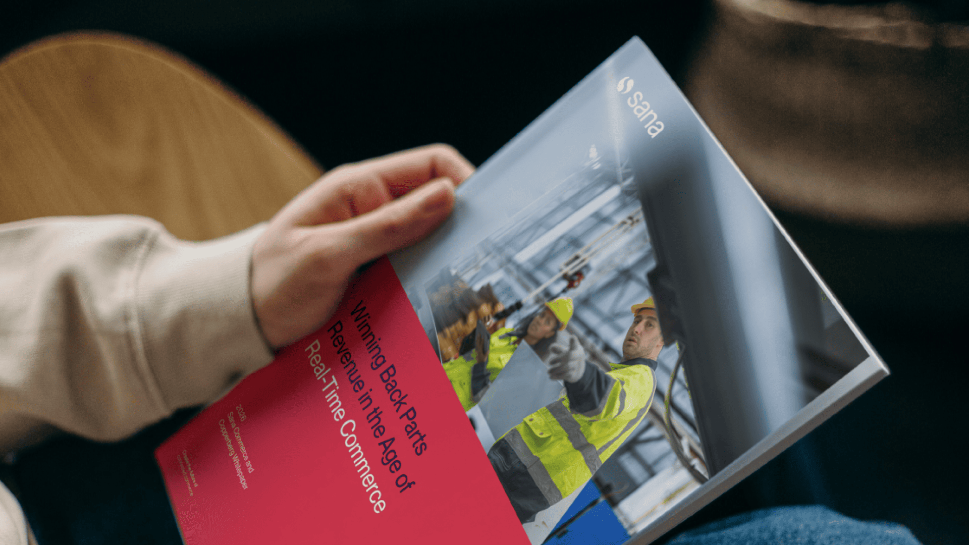
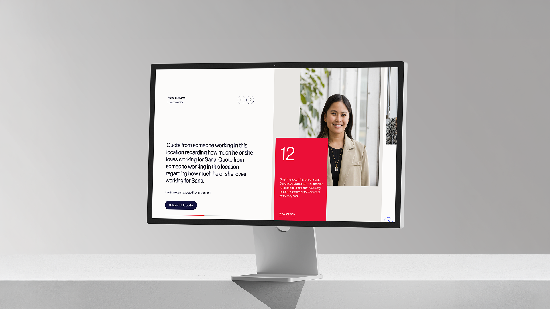
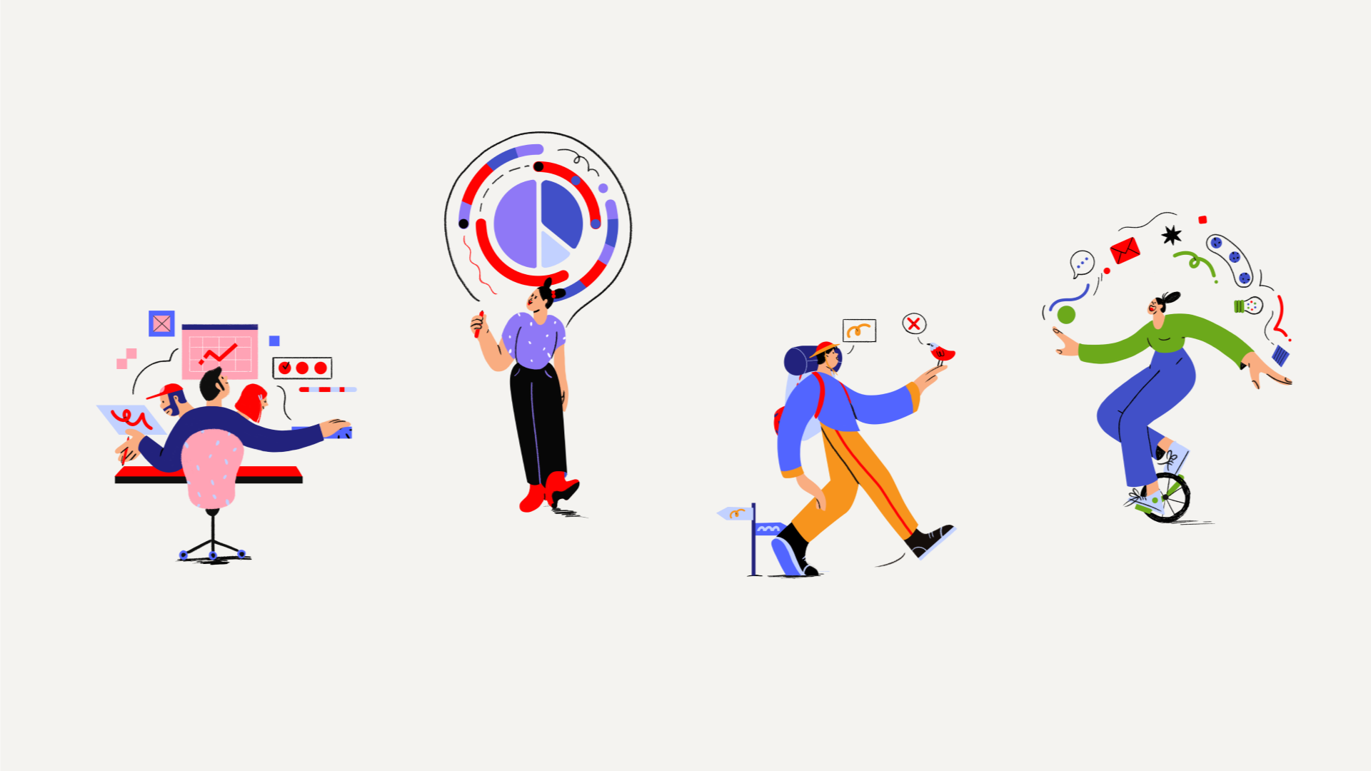
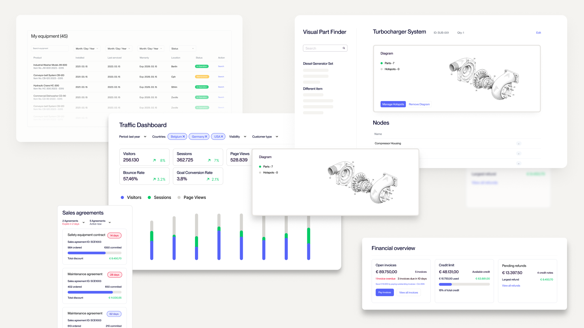
Sana’s website needed a breath of fresh air, and we gave it. Keeping all the design fundamentals that defined the Sana, from wireframing to fixing images, we gave the website the soul it deserves. Beyond the website, they needed materials for both clients and employees. This means crisp social media posts, clear brochures and reports, and versatile illustrations.
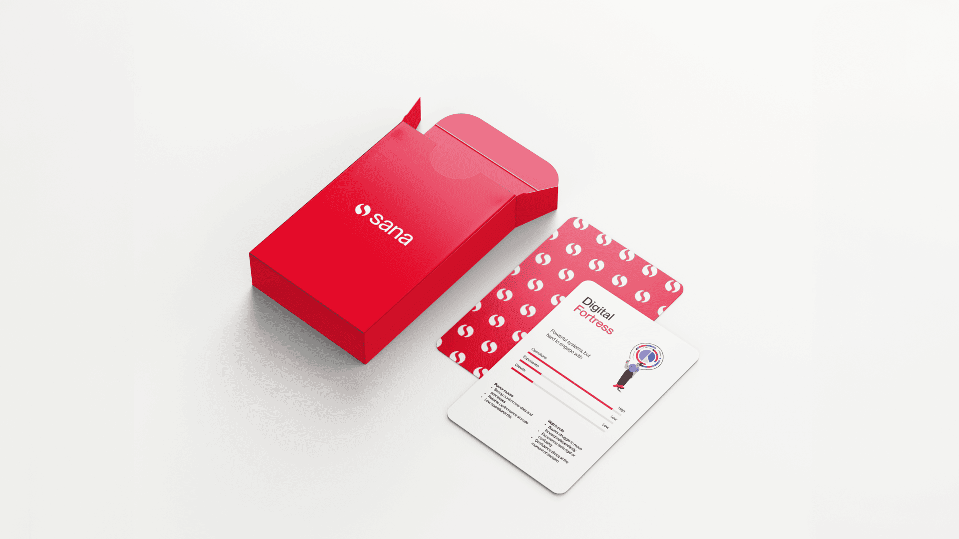
Did we mention that we also made them a card game? We like our B2B fun.
This Result
A brand that works as hard as the software it represents.
Every deliverable from print to online that speaks the same visual language. The modular systems we built mean Sana's team can keep producing great looking work long after the project wraps.
That's the goal: not just to make things look good, but to make it look good and feel right for a long, long time.
Latest works
